HUD remade
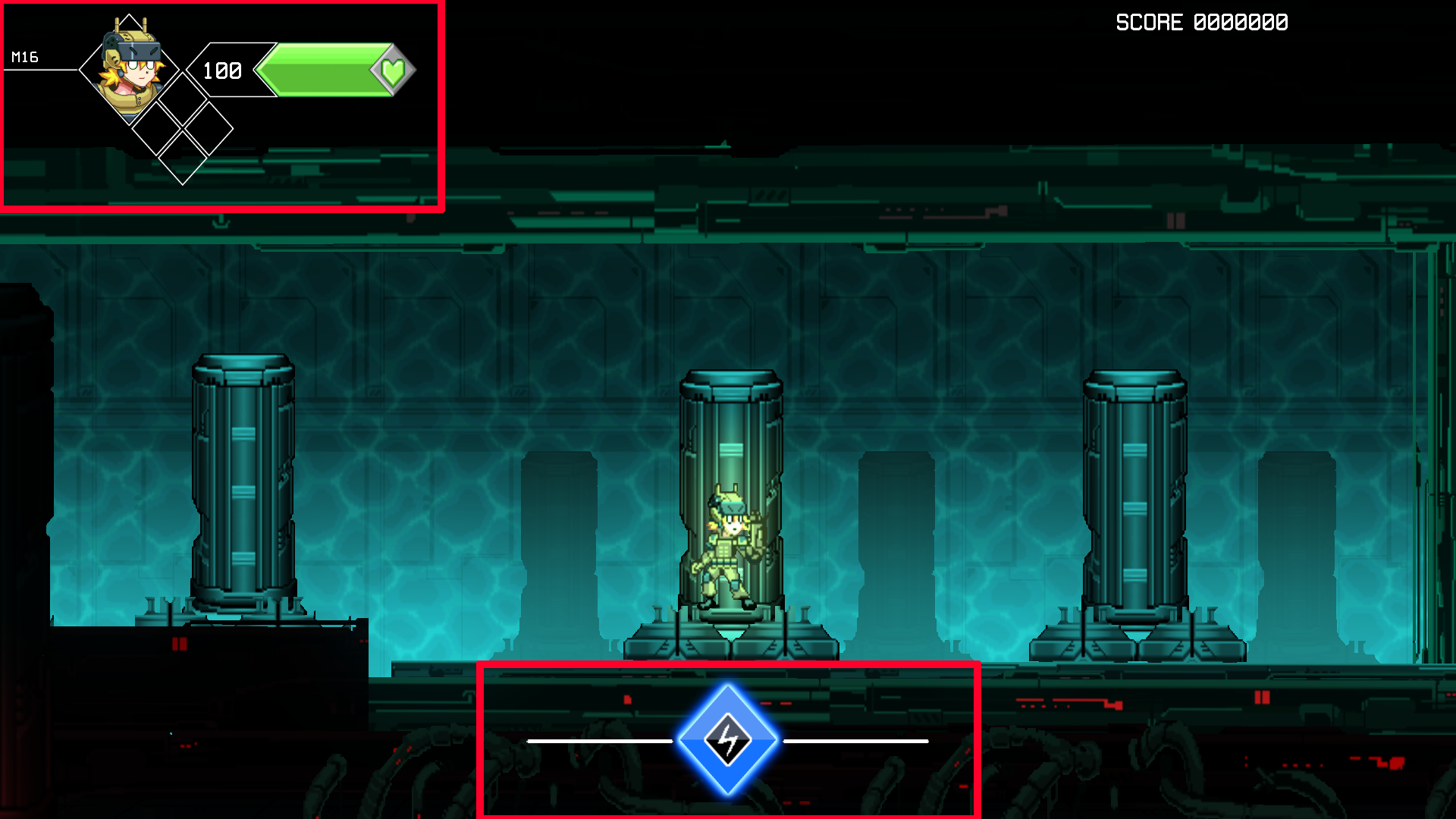
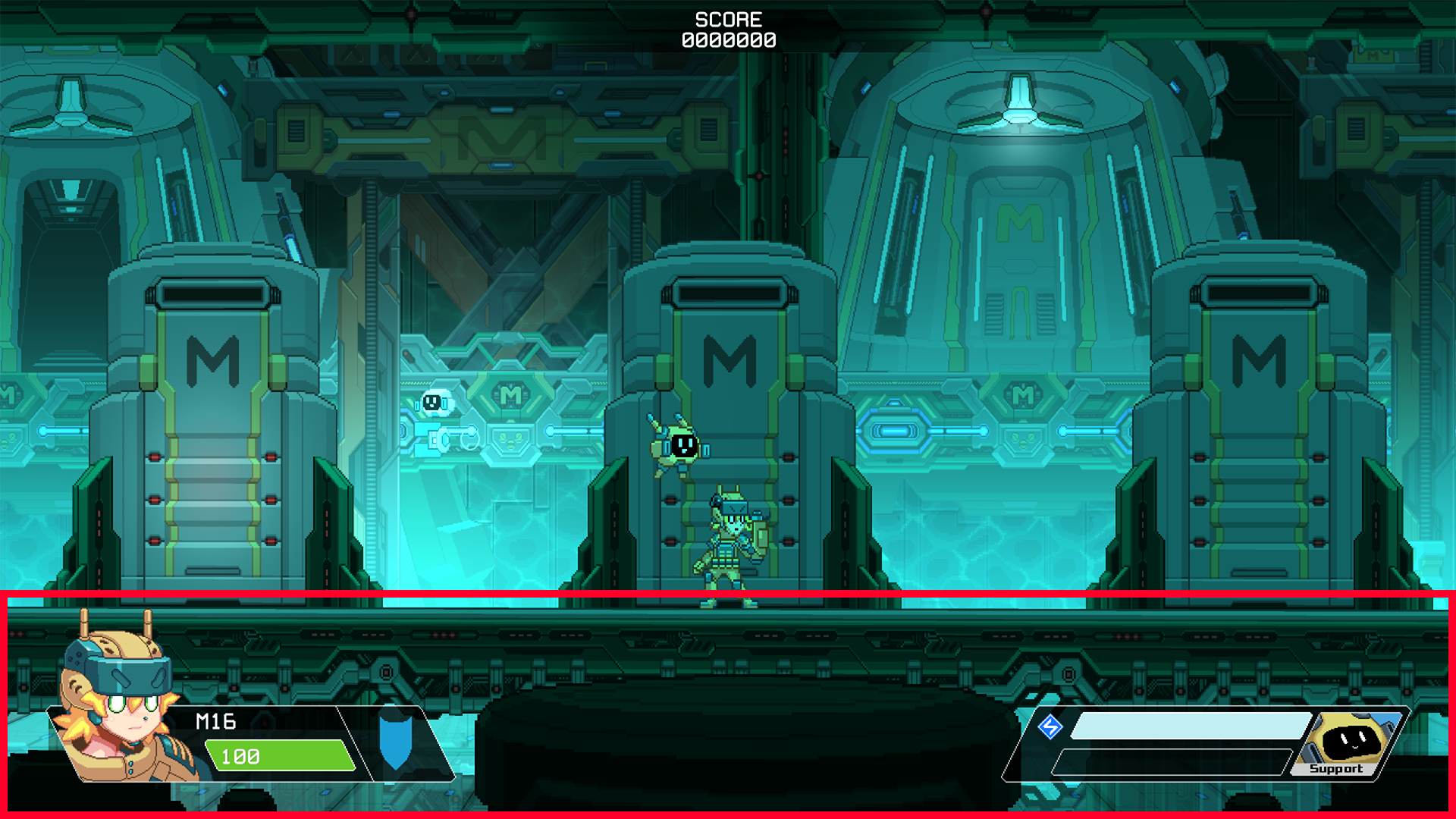
We replaced the previous HUD layout into something new with much simpler design.

The previous one was weirdly quadrant and too small.
Our main focus was to use energy in the game, so we added energy icon at the center of the bottom of the screen.
But it did not work properly. Before making, we actually skipped the whole understanding of relation between the HUD element and the player's view.

So, we added all the interfaces at the bottom of the screen, considering most characters' position were located at the bottom.
The Small HUD was a problem, and it would modify its size.

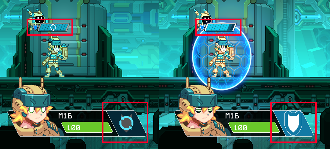
After thinking about character's special abilities being frequently used, it's placed on top of the character's head and at the bottom so player can check the status in their view at any time.
Player's view is very important to making HUD. Be sure to remember that.
Get Operation E.C.H.O. (Demo)
Operation E.C.H.O. (Demo)
| Status | In development |
| Author | Greenlegacy |
| Genre | Platformer, Action |
| Tags | Fast-Paced, Pixel Art, Retro, Shoot 'Em Up, Singleplayer |
| Languages | English |
More posts
- Leah Run & Stumble.Sep 06, 2023
- Animation progressAug 22, 2023
- It's been a whileJul 12, 2023
- Cutscene testApr 18, 2023
- Cutscene progressApr 02, 2023
- Emily run cycleMar 15, 2023
- Some progress of cutscene workMar 11, 2023
- The cutscene element is getting tough...Feb 26, 2023
- Player sprite remakeFeb 10, 2023
- Let's back on track!Feb 04, 2023

Leave a comment
Log in with itch.io to leave a comment.